
"Dismantling the False Feeling of Separation"
New Voices for RJ Voter Campaign Case Study

i. intro
I think a big question I have every time I vote is ‘What difference is this going to make in my life or the lives of the people in the community I live in?’ I know this voice in my head is sometimes dramatic, but there is definitely an overall sense of frustration. I just think that a lot of us millennials have seen a lot in the short time that we have been adults. We went to college like we were told, came out of it with a ton of debt and no promise of any job security. We were promised the world and then told to sit on the bench while the older generations continued on with no intention to give up any control. Don’t get me started on 2020 and all the dreams sold to us that being online and never going outside would improve our quality of living. Living like that just puts you in a place of feeling a little pessimistic. And then here comes the 2024 election. Two candidates that no one is really excited about and the cycle starts all over again. Kinda feels like the twilight zone. In a society where most people think the only power they have is to vote, how do you break these cycles and improve our and our neighbors lives.
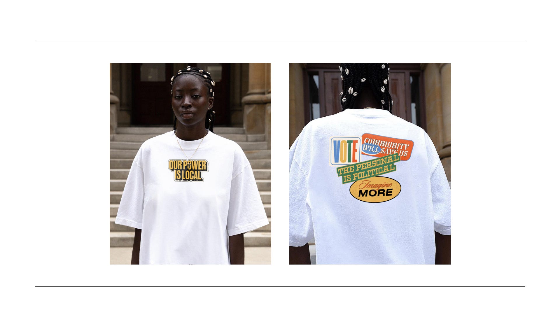
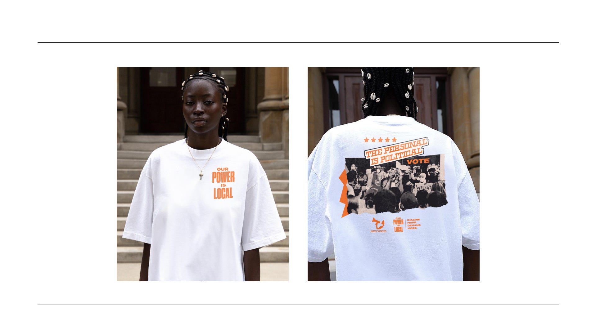
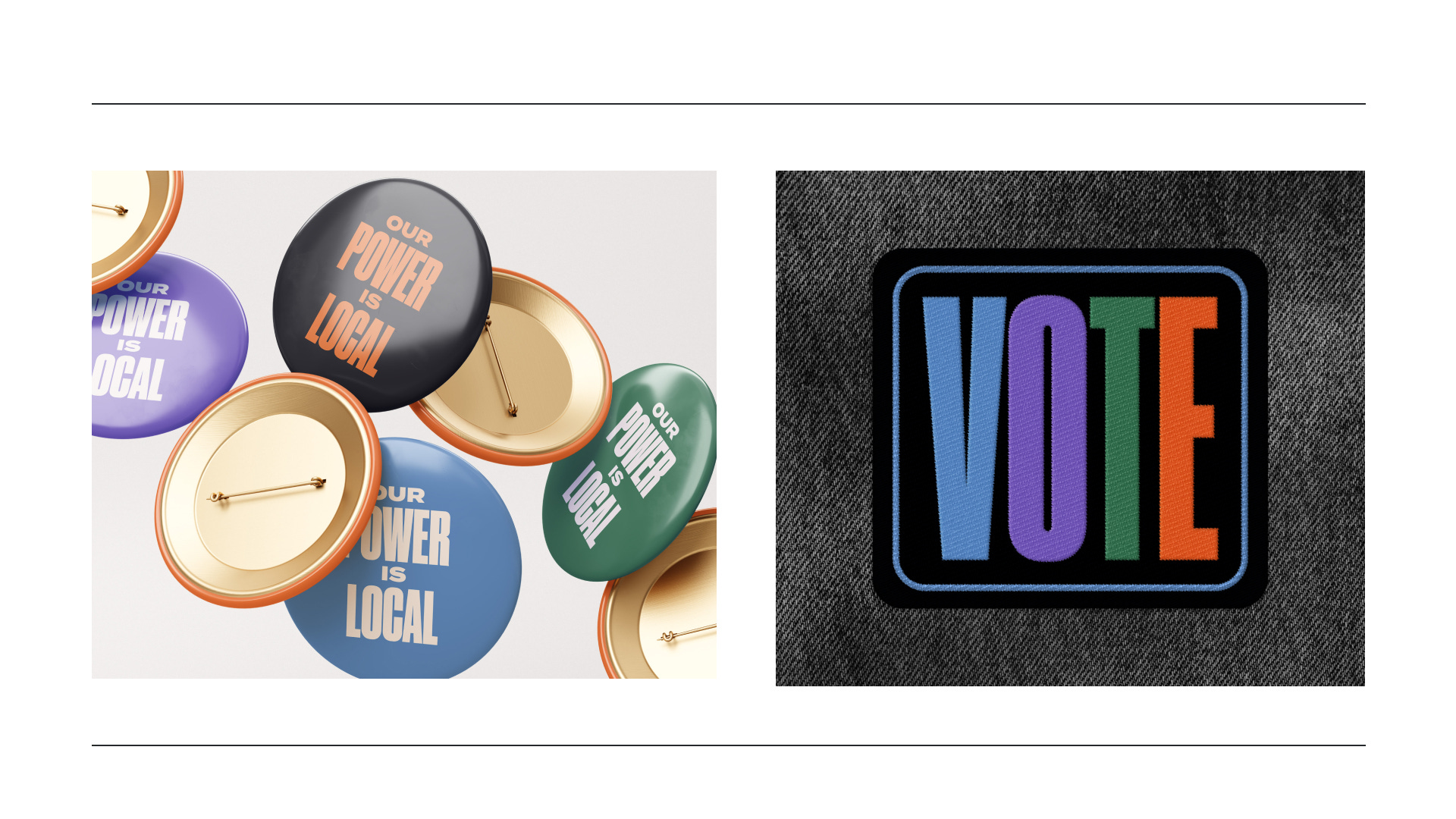
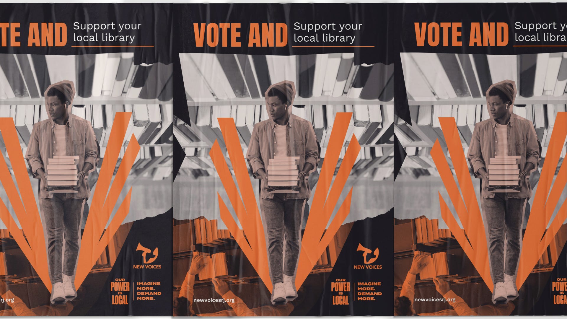
In August of 2024 I was approached by a non profit called New Voices for Reproductive Justice to lead the visuals for a voters campaign for the 2024 election. New Voices is a Reproductive Justice organization that supports and builds power for and alongside Black women, Black queer folks, and Black marginalized communities through leadership development, community care, resourcing, and mutual aid. I worked directly alongside their Executive Director Beulah Osueke to bring this voter campaign to life. I was asked to art direct and produce assets for this campaign to take life across Cleveland, Philly, and Pittsburg. The assets included a brand with supporting pieces, apparel, pins, stickers, and a zine for each city.
ii. discovery
So now that we have introduced what we are doing here let me share the plan. For working with me I always start with some kind of discovery session. Usually 90-120 mins to capture all of your knowledge as the clients and align both of us on a strategy to go forward with. Design without strategy is a waste of time. I’ll say it again design without strategy is a waste of time. Aimless acts to make things that the client think are ‘cool’ is exhausting work and leads to frustration on both sides. In these sessions I put the creative thinking mind that cost me $60K+ and 6 years of college to work haha. These sessions are broken down into goal setting, messaging, target audience, and visual inspo. We are here to dive deep into these items to make sure we know everything about them. There have even been sessions where we realize we are missing something and it gives us the opportunity to build that piece to make sure we have all we need to make a successful project. Go slow to go fast is really the model here.
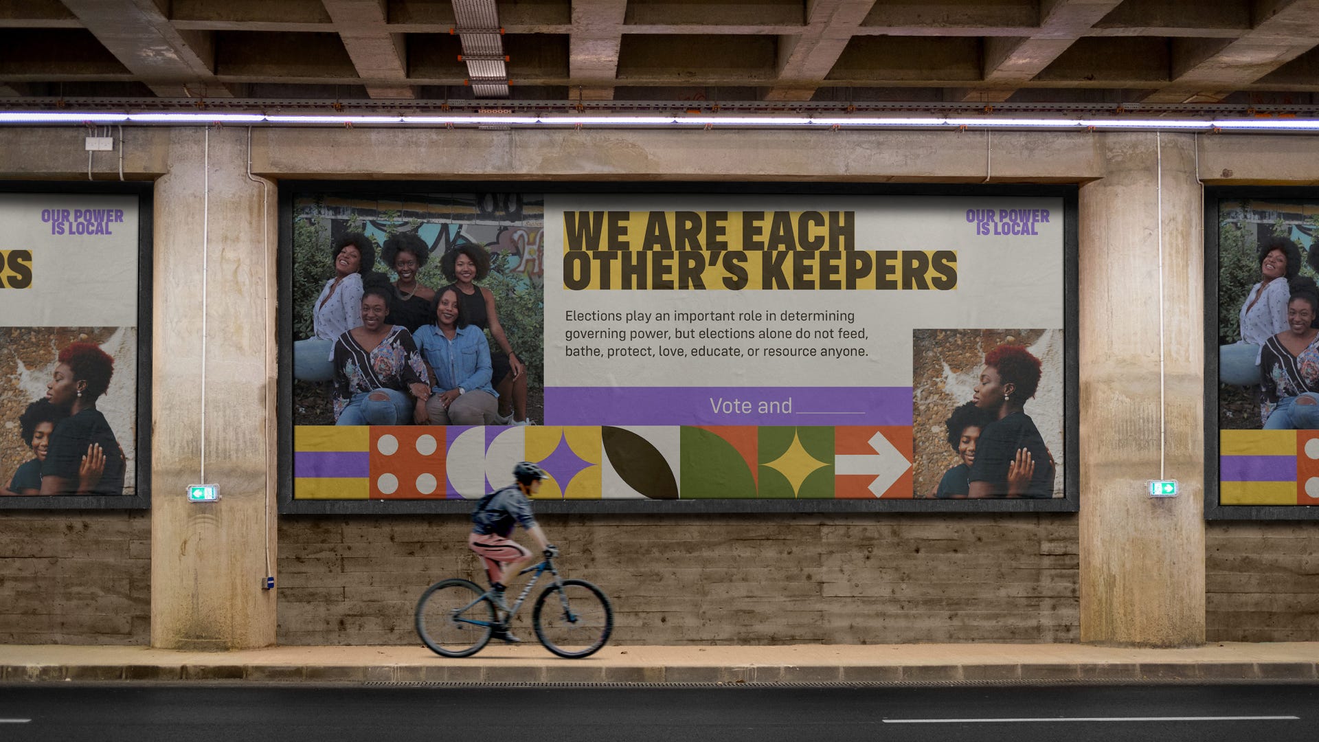
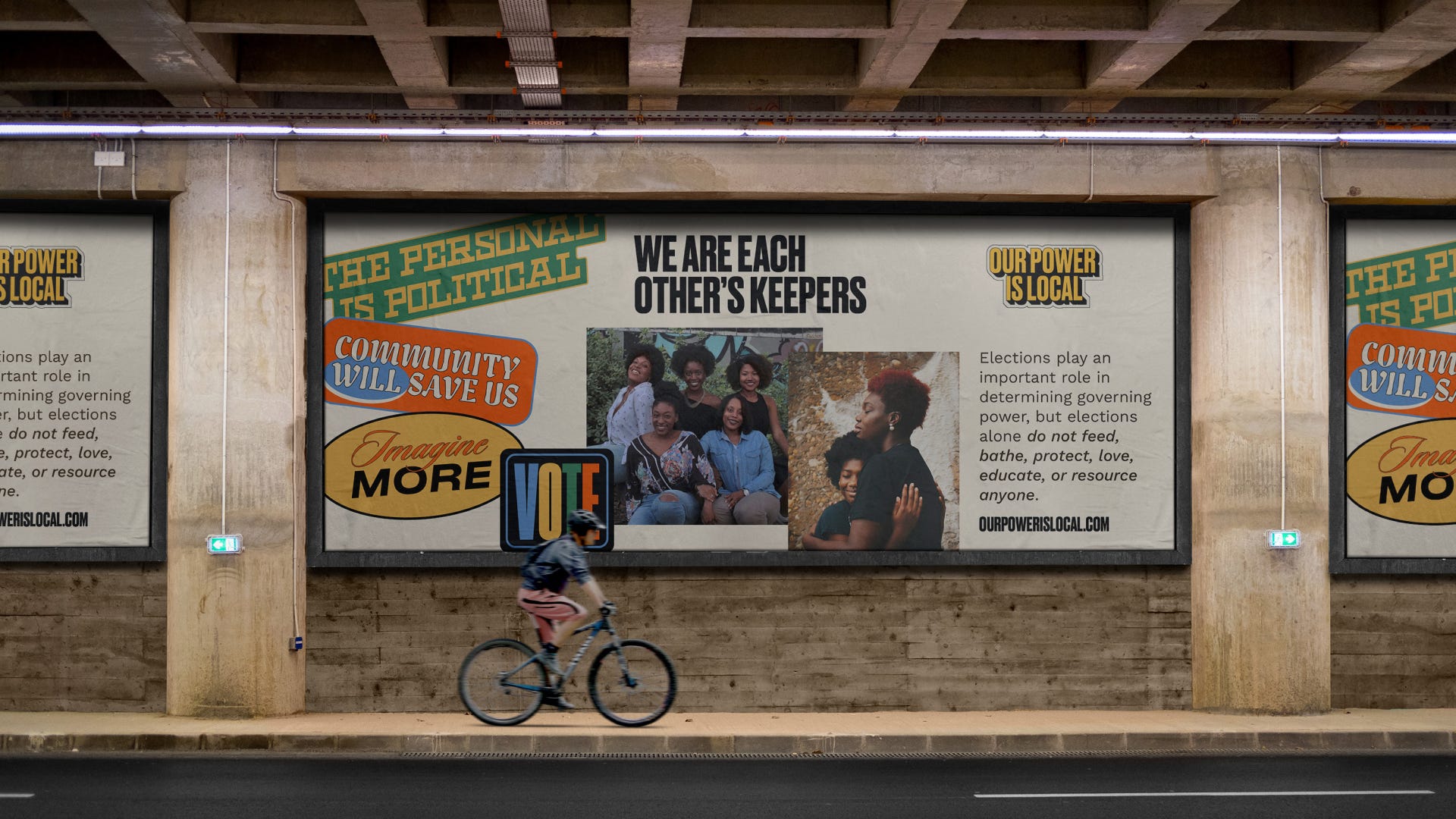
I think the most interesting part of the discovery session for this project was the messaging. New Voices provided me with some really powerful phrases:
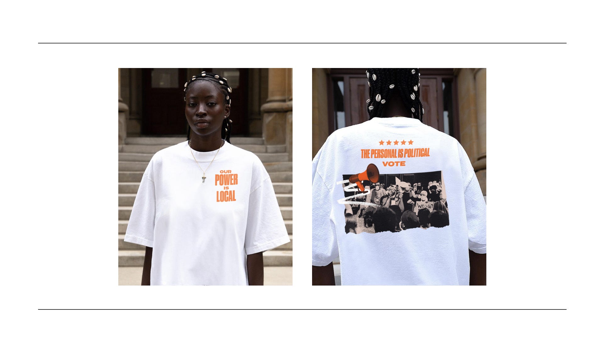
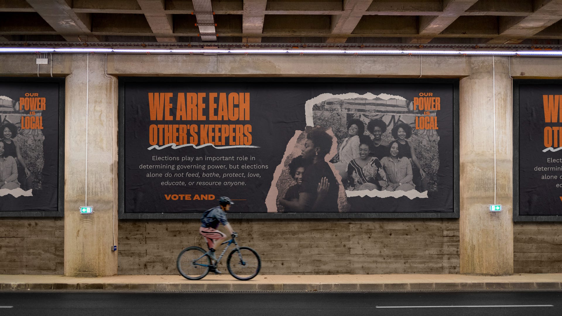
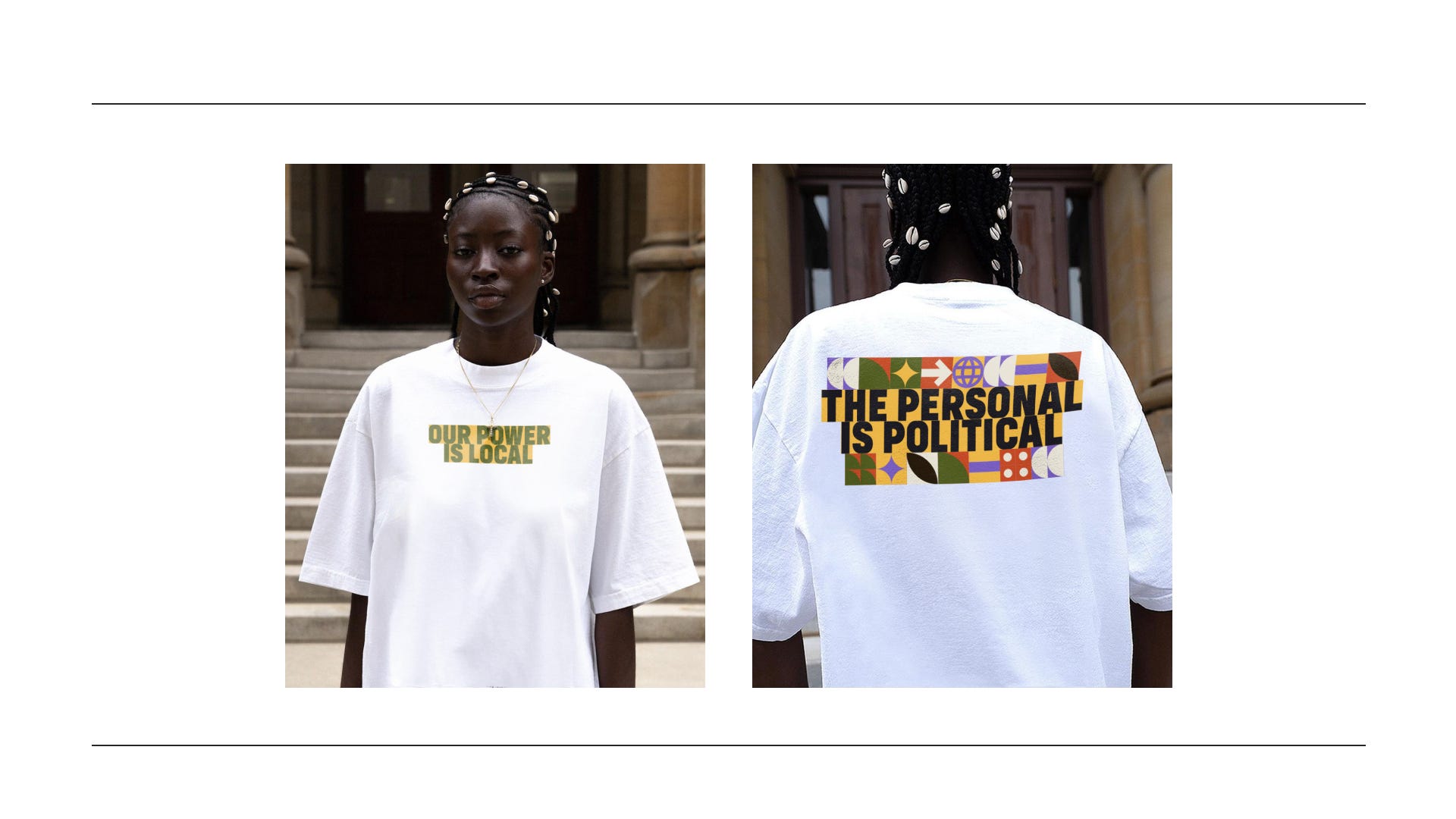
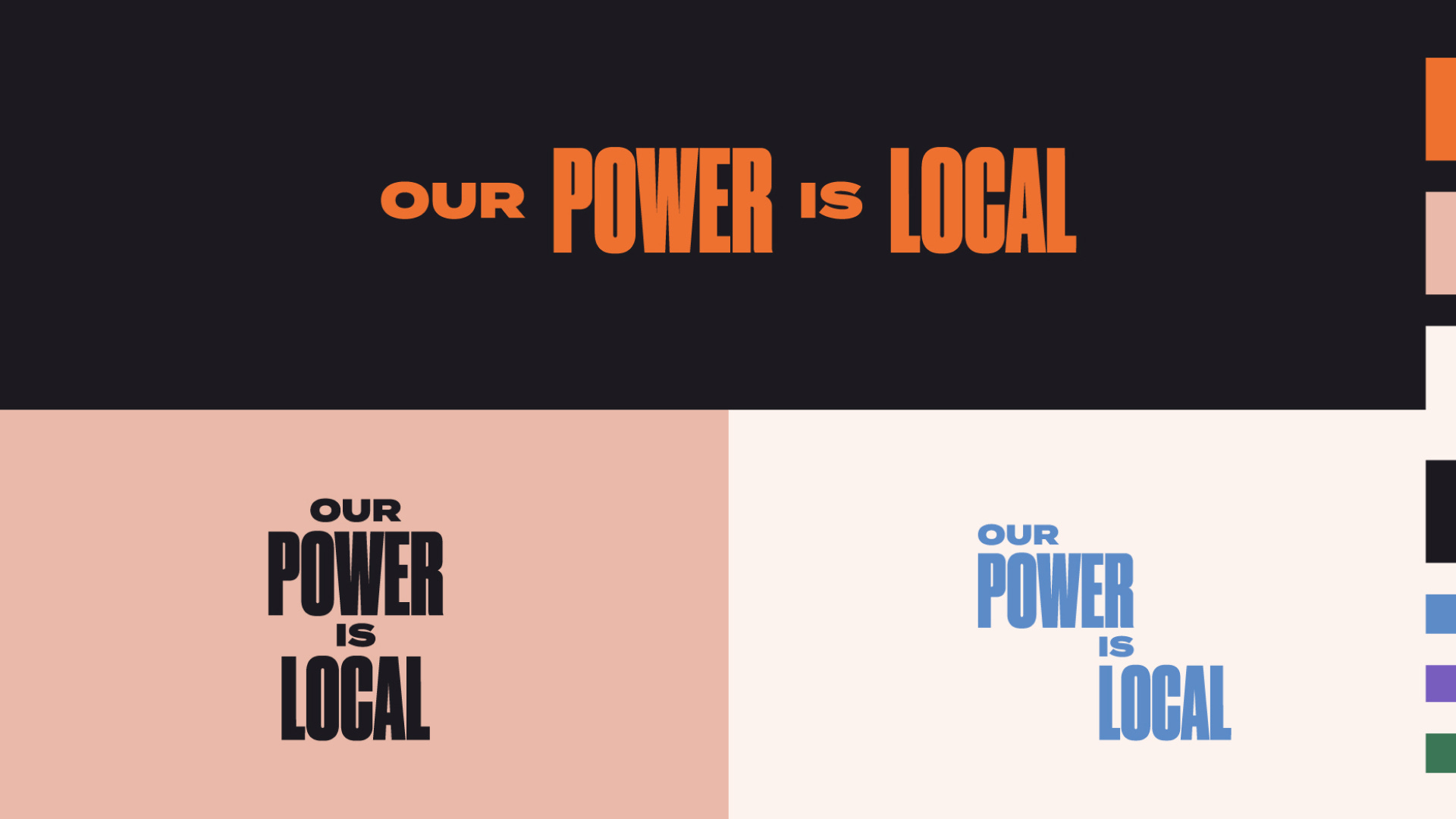
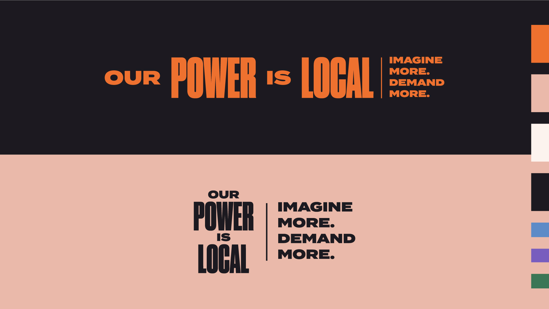
Our Power is local
Small does effect the large / Community is essential
The personal is political
We are each other’s Keepers
Vote and?
This was a project where I thought it was important to start with words and feelings to truly capture how people were feeling at the moment. We really wanted this campaign to mean something to the people who came in contact with it and that again takes getting to the heart of the matter in the discovery process. Yes voting is a big deal, but to feel supported outside of that system is also a big deal and can be achieved by all members of the community at a much lower level. We are genuinely talking about taking care of your neighbor. Dismantling the false feeling of separation that we all live with. Again yes vote, but what else can you do for the people around you? This was the core message we wanted to shine in the campaign materials.
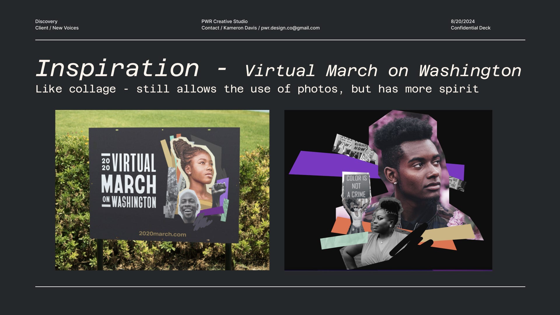
Something else that I think might be interesting from the discovery phase is the inspo that we started with to kick the project off. I always love seeing where the visual idea started.
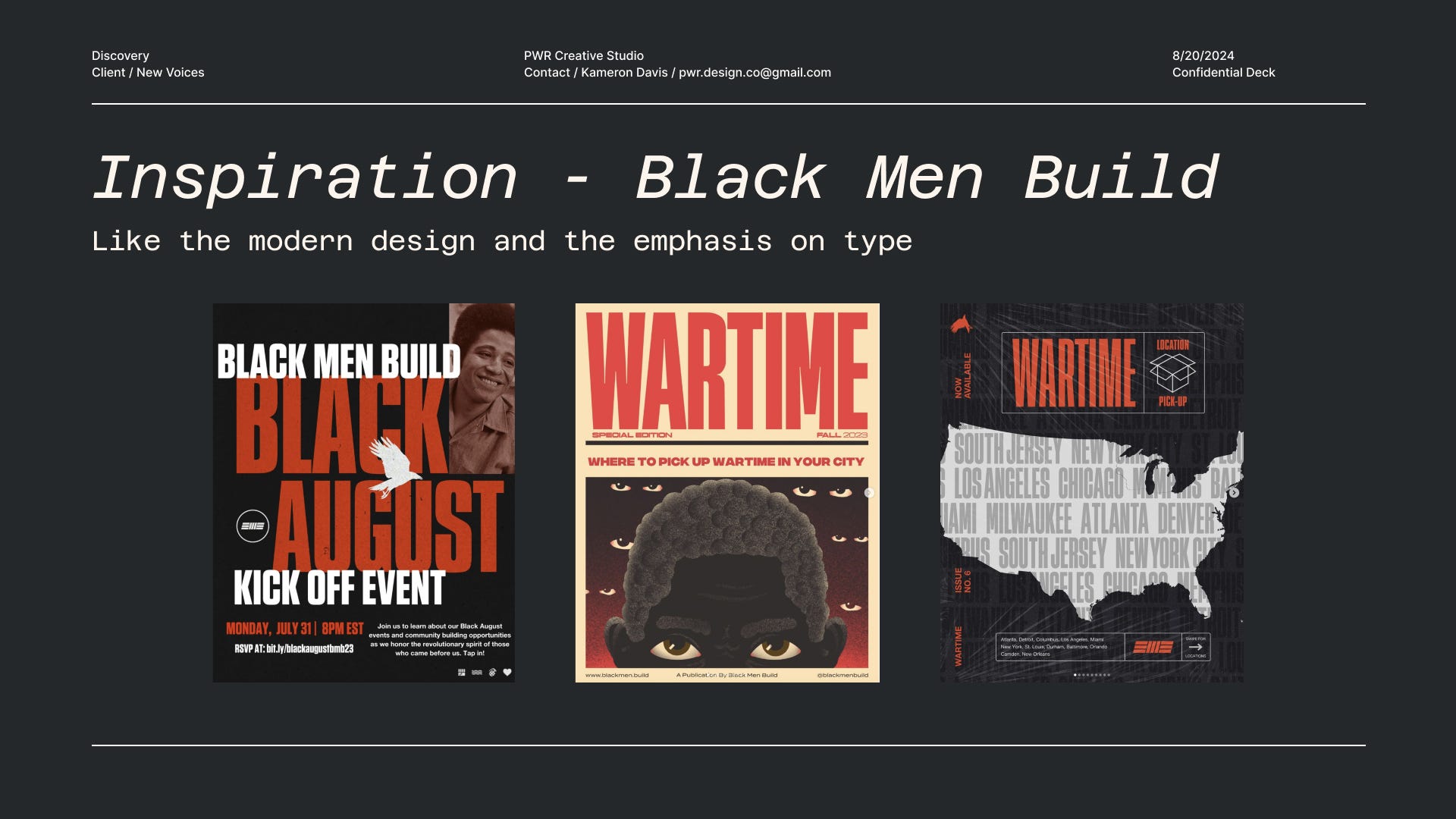
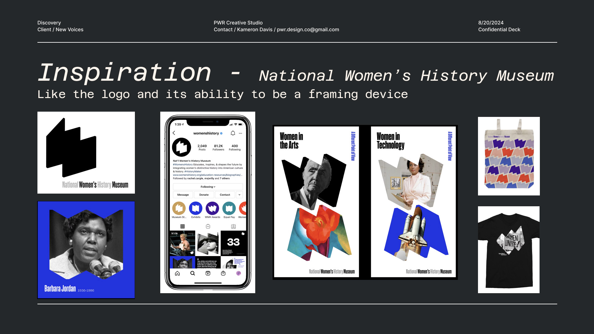
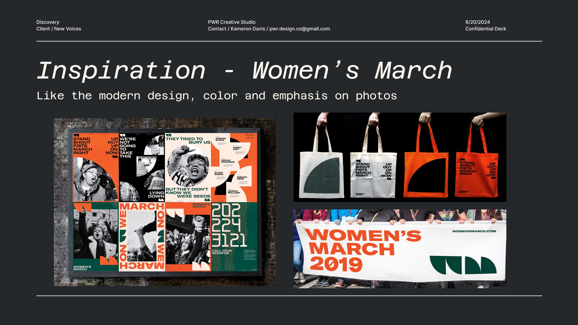
iii. concepts
One important note that I start this part of the process with and will add here is: ‘Don’t panic if you don’t love a concept at first sight. We are very much still building our look so nothing here is complete or final. It’s new, odd, and unfamiliar. Take your time with it all.’ I learned to include this note from Amy and Jen Hood of Hoodzpah! I have found that this note defuses the anxiety in the client and makes them feel like we are both on the same page with how they are feeling. Creating work together is a tough chore especially on the client end. There is a lot of risk involved for them so being mindful of how they’re feeling is also part of the job. Human first is always going to be my approach.
→ concept1 - collage
1 – Most flexible concept. Allows the use of a lot of different types of graphics (photos, type, illustrations, etc.)
2 – With the type of photo editing that is used here you don’t need the most high quality photo
3 – This style is probably the most trendy and used in the political / black culture space
4 – Other applications: if we were to apply motion to this concept it would have a stop motion feel. Graphics would slowly crawl into place
→ concept2 - modular
1 – Most variable concept. With all the different colors and icons in this concept there is a lot of different looks that can be achieved which keeps different applications feeling fresh
2 – This style is also pretty easy to apply. Relies on a grid system and photos won’t need any photo manipulation and icons can be used as photo frames
3 – Other applications: if we were to apply motion to this concept the boxes and words would scroll right to left.
→ concept3 - sticker
1 – Most variable concept. With all the different colors and icons in this concept there is a lot of different looks that can be achieved which keeps different applications feeling fresh
2 – This style is also pretty easy to apply. Relies on a grid system and photos won’t need any photo manipulation and icons can be used as photo frames
3 – Other applications: if we were to apply motion to this concept the boxes and words would scroll right to left.
iv. finish line
When it comes to choosing from concepts I always feel like 70% of the time it ends up as a Frankenstein of 2 of the concepts, which I always embrace with open arms. “Get over here you big lug!” In this case it was concept 1 and concept 3 which I actually really love together as one. It gives you a little more versatility by being able to have the stickers as assets that can be used in graphics and as physical products. Getting to double dip on their impact.
In building out the final look I created a responsive logo system, which is a must if you work with me. Can’t have you out here with a brand with only one logo that only fits nicely in a square. So I built out a horizontal logo, stacked, and an alt that is kind of in between both of the others. I also expanded the color palette to include green , purple, and blue which just gives us more to work with and keep things with. Once you have all of that it feel like the mixing of the 2 concepts was more so meant to be!
Some times when you get to the building phase you realize you don’t have the time to execute all of the things that you wanted to. With concept 3 I really wanted to put some motion to the stickers that were created. I think this would have been a really cool aspect for social media. A way to get these messages from just being messages on products into the digital world where people could share them and others not in these places could also get excited about these messages. Just didn’t get the opportunity. Might be something I do for fun one day and just add them to this case study which is something I love because it keeps these as a living documents that can grow at any moment. Case studies are yes an opportunity to show work, but also an opportunity to show what extra you can come up with in your brain to build out the world.
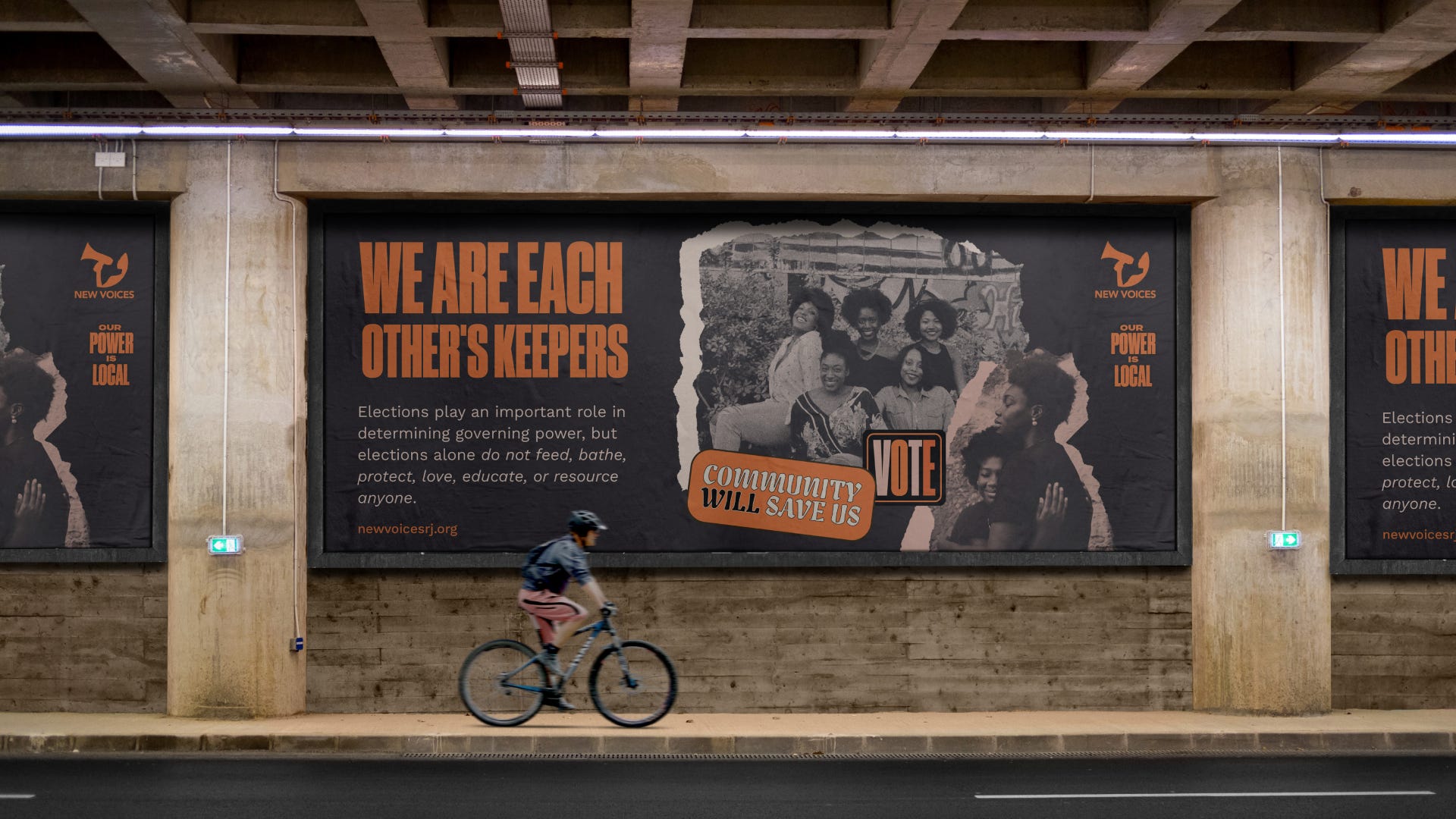
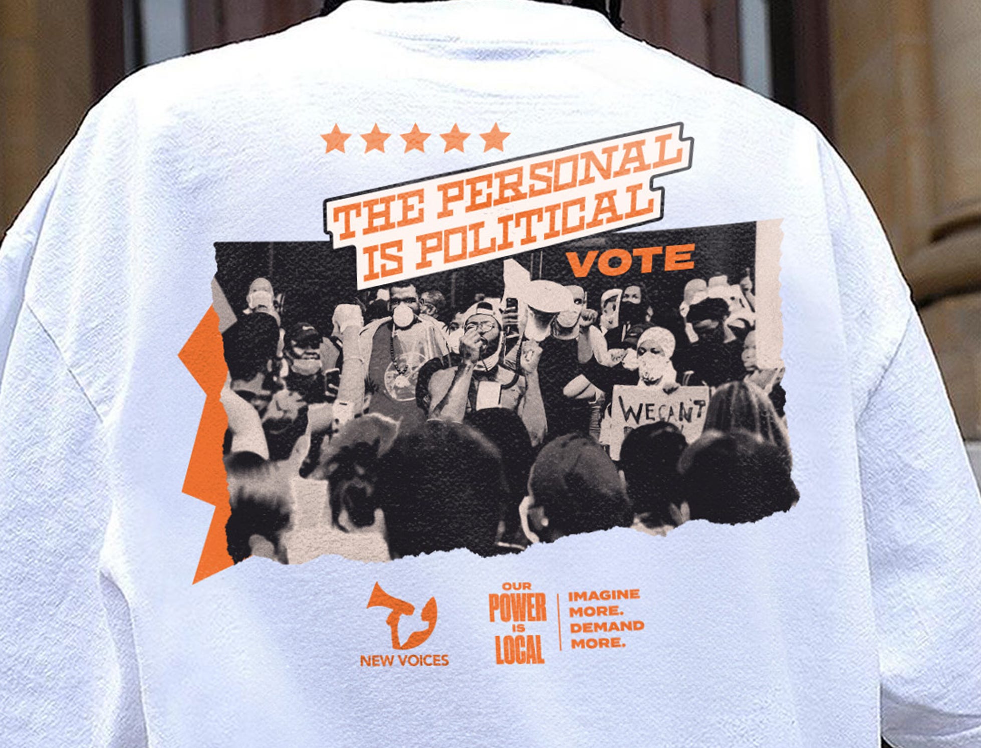
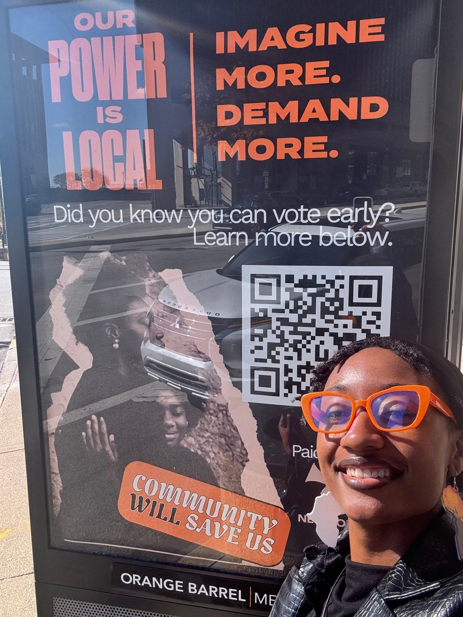
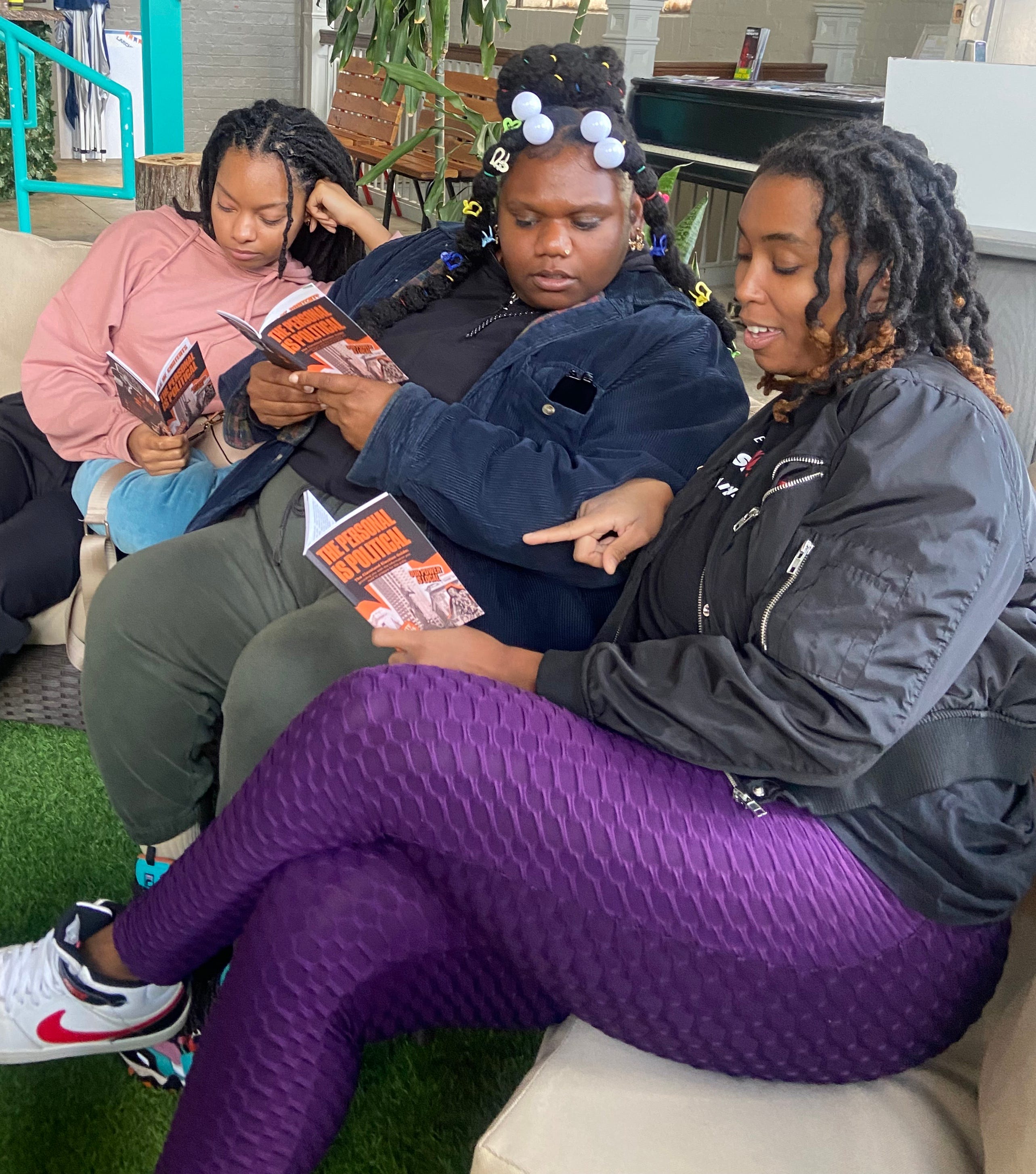
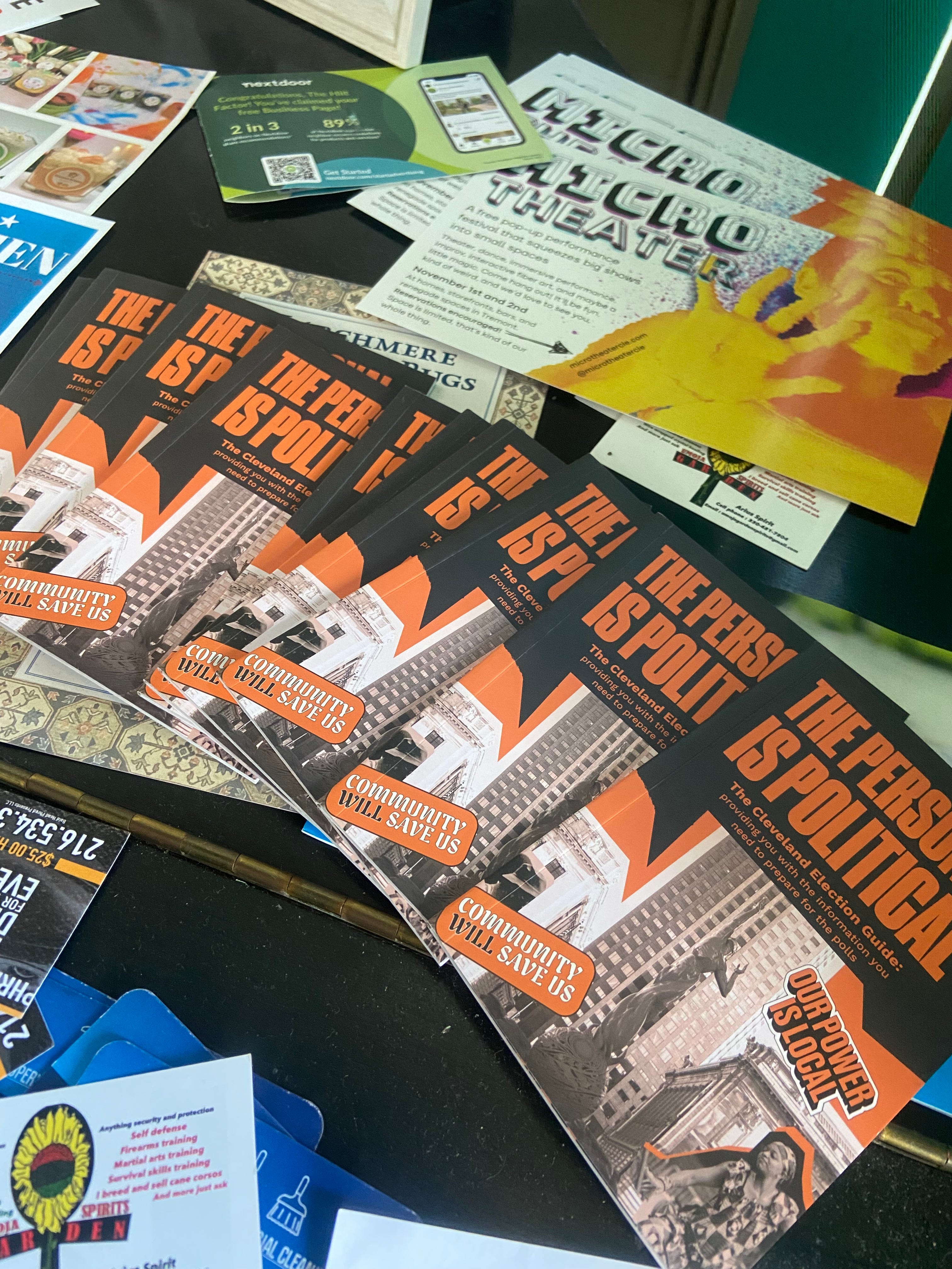
v. real world
This is the most beautiful part for me. My work going to be viewed in the actual real world. These are photos I got from the client of their members interacting with the assets we made together. It is fun to create on my computer, but nothing beats seeing real pieces that you can touch.
I loved this project and what it meant/means to our society. Vote on the couple days that it happens a year, but spend every day taking care of your fellow community members. They both matter.
Thanks for reading Vibe Check! Subscribe for free to receive new posts and support my work.
What a great campaign Kameron! I loved reading through your process and the way you encourage clients to embrace the creative journey. Seems like you do a great job leading them through and reminding them what stage they are in. I'm sure that brings a lot of peace to the process for them.
Also glad to hear that I'm not the only one who ends up with a "Frankenstein" concept. Sometimes it works and sometimes not, but it's good to keep the client informed either way.
Proud know and love you! 😘